A recent client project seen me design and develop an online marketing solution for Pension Expert, a leading pension advice company providing consultation on various types of pensions and retirement plans.
They contacted me about rebuilding their website to deliver on the goal of providing their visitors a way of easily getting in touch with a pension consultant. As well as that, Pension Expert also possesed a dated logo, so branding was a must to make the website appealing – thus leading to future conversions and more business.
The website employs on-page search engine optimisation to assist it in ranking as highly as possible via organic measures. As standard, the website is also pagespeed and mobile optimised – a must for the modern web.
Overall, the Pension Expert team are happy with their new online presence, and the results from their website.
Visit https://www.pensionexpert.org/ to take a look at the project in the real world. Alternatively, contact me by clicking here to learn more about how I can help you and your business.
Ever since starting my career, I’ve always moved from gadget to gadget, and device to device, in a mission to fine tune my set up and be as comfortable and as productive as I can be.
The most common thing to change is my monitor (or monitors, depending where we are in the history of my setups). Over the years, I’ve gone from having one monitor, to two, to three, to two wider ones, and so on. This would change pretty much annually, until in 2018 I replaced two monitors with one 34″ ultrawide curved LG monitor. This served me well for over 2 years, and allowed me to have the benefits of two “normal” monitors, but without the bezel or gap in the middle.
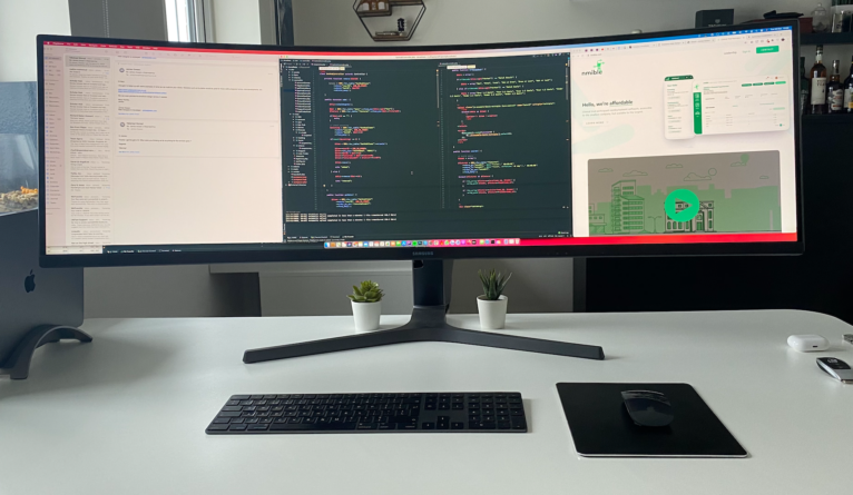
I get bored quite easily though, so the time recently came for a change. I had eyed up the Samsung LC49RG90SSUXEN 49” Curved Gaming Monitor on Amazon for a long time, and I noticed the price dropped so I snapped it up. Delivery was fast, as usual with Amazon Prime, so I had it within 1-2 days.
Now though, I’ve used the monitor daily for well over a month, so I feel that’s enough time to comment on the practicality of such a thing. The first major obstacle for most will be making sure you have enough desk space. For a monitor this large and this heavy, the legs are pretty beastly. Alternatively, you could wall mount the monitor – which would be my preferred option if I actually had a wall directly behind my desk.
This monitor really is a productivity boost though. At 5120px wide, it’s the perfect tool for pretty much any job in the digital world. At any given time, I can see all of my communication apps (Slack, Skype, etc), as well as my code, and any designs I’m working off – all at the same time with no need to switch between windows. The time saved through this method alone is worth it. Concentration can be distributed to any program almost immediately, and it comes naturally as well without any obscene head movements – which some may expect on such a large and curved screen.
I use a 16inch MacBook Pro, so connecting to that via a Thunderbolt to DisplayPort cable is seamless, and I imagine would be seamless for any other computer.
I’ll never actually use this monitor for gaming, so don’t be distracted by the fact it’s a “gaming” monitor. I’m sure it’s great for gaming, but it really is next level for productivity.
Admittedly, I was worried that monitors like this would be a one-time fad, but after a month of use I would completely recommend this monitor for productivity, for pretty much anyone who works in the digital space. I’m a web designer/developer by trade, but I can see this being perfect for video editors, photo editors, musicians, and so on.
If you’d also like to take the jump into the next level of productivity, then the cheapest I’ve found this current monitor is on Amazon, available here.
From a users point of view, accessibility is one of the most important aspects of a modern website. An accessible website means that users who have learning difficulties, or may be impaired in a particular way, are still able to consume and enjoy the contents of the websites they visit. These users often use screen readers and other devices to digest the contents of a website.
Not only that, but accessibility is also a good marketing and business move. Google and other search engines use accessibility as a key ranking factor for websites today.
A professional web designer will consider this when crafting a website, so I’ve put together some tips below for achieving this:
The Language Attribute:
Set a lang attribute to the language your website is presented in on the opening <html> tag. For example, <html lang=”en”>.
Alternative Image Content:
It’s important that all images have alt attributes set on the <img> tag. This helps to describe, in text, what the image is – especially useful for those who can’t see images, or if an image doesn’t load.
Allow Zooming:
Especially on mobile devices, don’t set [user-scalable=”no”] on the meta viewport tag. It’s good practice to let a user have control over the web page, and they may want to zoom into a specific element they cannot see properly.
Use ARIA Attributes:
Elements such as aria-label=”What this button does” come in handy for elements that do not have a clear text meaning behind them, such as a <button> that only contains an icon.
Avoid Low Contrast Text:
Text on a background which causes it to have a low contrast is troublesome for some groups of disabilities and makes text hard or near impossible to read.
Use Tables Only For Data:
Luckily, the days of using HTML tables for layouts are long gone. But it’s best to make sure you’re still only using HTML tables for actual tabular data, and nothing else.
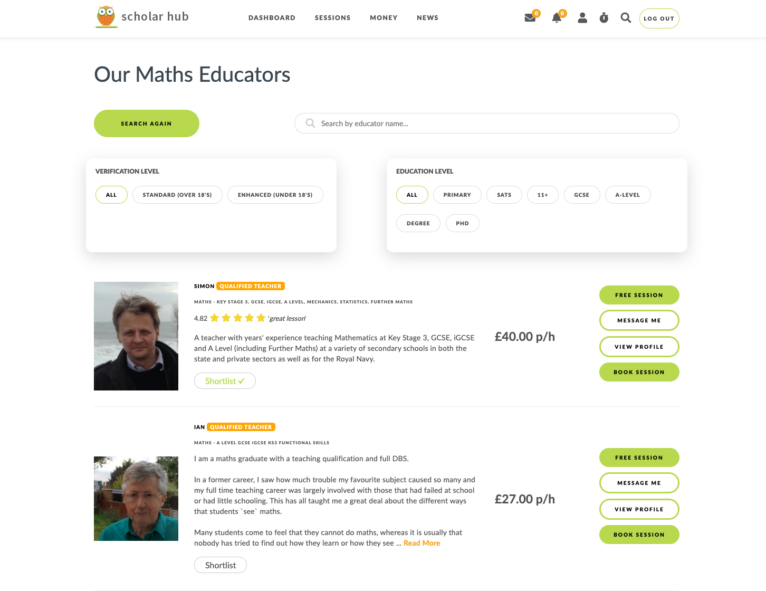
One of my longer term client web design/development projects has seen great growth since the beginning of our relationship. Originally tasked with creating an eLearning platform that allows students to learn about religion online, Scholar Hub quickly grew into a platform that allowed students of all ages to learn about any subject. My continued relationship with them has allowed Scholar Hub to offer:
Easy and intelligent search to find the right educator
A streamlined booking process for both the student andeducator
Quick communication via on-platform messaging
One-click future session bookings and payments
Instant AI-powered ID verification for educators
Advanced technological security
Secure card handling
Social feeds
A comprehensive learning space, allowing students/educators to video call, share screen, use an interactive shared whiteboard, message, and send files – all in one online platform.
Scholar Hub is still in its early days, but I’m excited to see where they go and support them on that journey.
If you’re looking to learn something new, or would like your children to learn something extra outside of school, then head on over to https://www.scholarhub.co.uk/.
Are you looking to have your own platform developed? Contact me to find out more today!
It’s been at least a year since I even touched the design of my site, and with how fast the web moves forward in terms of both design and development – I thought the start of the year would be a good time to address the situation (go check it out at https://jamesdowen.com/).
My site currently ranks well for specific keywords, so the main challenge was maintaining those crucial rankings. One of the most important SEO ranking factors today is pagespeed, and with my old site scoring 99/100, this was pretty hard to match, let alone beat. This alone involved taking great care during the programming stage, and ensuring every asset was appropriately compressed and served, but not to the point where the assets lose too much quality and begin to look blurry.
The other is content. My site has always being a one page site since its inception, so I’ve kept that same structure and same content throughout (apart from changing a few words). This means the design refresh uses pretty much the exact same content as before.
Old version of jamesdowen.com
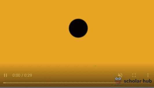
Another key concept was to include animated elements, fitting in with a modern web trend of creating engaging content. On desktop, we feature an animated particle blob effect that the user can control with their mouse. This is a quirky feature to help boost interaction. This isn’t present on tablet or mobile devices though due to performance issues.
Animated particle blob
As well as that, we have certain user controlled elements that are binded to scrolling events. The example below shows the / (forward slash) rotating with the speed that the user scrolls.
Rotating element on scroll
Further down, we have the services bubble, which essentially lays out my skillset surrounding a picture of desk/office space. Rather than it be displayed as a static image, I wanted to bring some life to this section. The background features a forever looping bubbling effect, creates with pure CSS, and each skill floating gently with a slight overlay.
Services bubble
Last, but not least, we have the menu and the start project/contact section. The particle explosion that takes place when opening and closing the start project area is something cool that I’m happy we adopted and managed to fit in.
Menu and contact sections
If you’re looking for a new website, then head to my very own new website at jamesdowen.com and I’ll be happy to help you. I’m a freelance web designer and developer, and I’m available to work on websites, web-apps and online systems.


 Easy and intelligent search to find the right educator


