Author: James (page 1 of 6)

Dark Mode Design: Best Practices for Accessibility and Aesthetics

As a developer with 12+ years of experience, I’ve seen first hand how fast dark mode has become a widely adopted design trend, providing users with a visually appealing and often more comfortable alternative to light mode. However, designing a good dark mode experience goes beyond simply inverting colors. To ensure accessibility and maintain strong aesthetics, designers and developers must follow best practices that enhance usability, readability, and overall user experience.

1. Use Proper Contrast Ratios

One of the biggest challenges in dark mode design is maintaining proper contrast. Low contrast can strain the eyes, while overly high contrast can be just as uncomfortable. Best practices include:

  • Ensuring a contrast ratio of at least 4.5:1 for text against background colors (as per WCAG guidelines).
  • Avoiding pure black (#000000) backgrounds; instead, use dark grays (#121212, #1E1E1E, etc.) to reduce eye strain.
  • Using lighter gray or desaturated text colors instead of pure white to soften the contrast.

2. Consider Color Perception and Readability

Colors can look different in dark mode compared to light mode, and certain hues may lose their intended emphasis. To optimize readability:

  • Use desaturated versions of colors to avoid oversaturation.
  • Check how brand colors translate in dark mode and adjust accordingly.
  • Be mindful of red-green color blindness when selecting status indicators.

3. Adapt Shadows and Elevation Effects

In light mode, shadows are used to create depth and distinguish UI elements. However, dark mode requires a different approach:

  • Reduce the intensity of shadows; opt for subtle glows or soft highlights instead.
  • Use lighter accent colors or semi-transparent outlines to indicate elevation.
  • Avoid deep shadows, as they can become less distinguishable against dark backgrounds.

4. Ensure Images and Icons Are Optimized

Dark mode can affect the appearance of images and icons, so it’s essential to:

  • Use transparent PNGs or SVGs for icons to adapt to both light and dark backgrounds.
  • Adjust the brightness and contrast of images to ensure visibility.
  • Provide alternative versions of logos that maintain readability in dark mode.

5. Allow User Preference and Easy Switching

Not all users prefer dark mode at all times, so providing options is key:

  • Implement automatic detection based on system preferences (prefers-color-scheme CSS media query).
  • Provide a manual toggle in settings for users to switch between modes.
  • Save user preferences using local storage or account settings.

6. Maintain Consistency Across Light and Dark Modes

To create a seamless experience:

  • Use a consistent typography and spacing approach across both modes.
  • Ensure that buttons, links, and input fields are clearly distinguishable in both themes.
  • Test UI elements in both modes to avoid unexpected issues.

Conclusion

Dark mode can enhance aesthetics and usability, but it must be designed with accessibility in mind. By considering contrast ratios, color perception, depth effects, and user preferences, designers and developers can create a dark mode experience that is both visually appealing and functional. Thoughtful implementation ensures a comfortable experience for all users, regardless of their visual needs or preferences.

Common Myths About Web Design

Web design is a field that moves at lightning speed—a harmonious fusion of creativity and technology that shapes the way brands communicate and users interact online. Yet, despite web design’s omnipresence, a number of persistent myths and misconceptions continue to muddy the waters. In this open letter, I want to clear up some of these misconceptions so that you (whether you’re a budding entrepreneur, a small business owner, or someone just curious about modern web design) can make more informed decisions and get the most out of your web projects.


Myth 1: “A Website Is Just About Looks”

The Myth:
Many believe web design is purely about aesthetics—choosing trendy colors, fancy fonts, and stunning images. They think that as long as the site looks nice, it’s “good design.”

The Reality:
In truth, visual appeal is only one piece of the puzzle. An effective website must also include:

  • User Experience (UX): Your navigation, content structure, and call-to-action buttons should guide visitors smoothly from page to page. A pretty website that’s confusing to use won’t yield results.
  • Technical Performance: Speed, responsiveness (mobile-friendliness), and accessibility are crucial to ensuring all visitors can access and interact with your site easily.
  • Conversion Goals: At the end of the day, your website should help fulfill your business objectives—whether that’s generating leads, selling products, or raising brand awareness.

Key Takeaway:
Yes, beauty matters. But you should always pair aesthetics with functionality, user-centered thinking, and strong performance. A holistic approach delivers websites that not only look good but also help you meet your goals.


Myth 2: “Anyone Can Build a Website Quickly and Cheaply”

The Myth:
With an abundance of DIY platforms, pre-made themes, and drag-and-drop builders, people often assume that building a website is as simple as choosing a template and hitting “publish.” They believe there’s no need to hire a professional.

The Reality:
While DIY website builders can help you get started, especially if you’re on a tight budget, there’s a difference between having a website and having a strategically designed website. Here’s what a professional web designer brings to the table:

  • Customization & Branding: A designer will help you stand out by tailoring the look and feel to your unique brand identity.
  • Technical Expertise: Professionals understand search engine optimization (SEO), page load speed, security protocols, and best practices that keep your site reliable and efficient.
  • User-Focused Design: Professional designers leverage user research and data to create websites that deliver a polished, intuitive experience, encouraging visitors to stay longer and convert.

Key Takeaway:
Sure, it’s possible to set up a simple site on your own. But when you need something that truly reflects your brand and converts visitors into customers, hiring a professional can save you time, avoid pitfalls, and ultimately increase your ROI.


Myth 3: “Design Is Finished Once the Website Goes Live”

The Myth:
Some clients think that after a website is launched, the design and development work is complete. They assume no further updates or maintenance are necessary.

The Reality:
Your website is a living, breathing entity that needs continuous care and feeding. Ongoing work often includes:

  • Content Updates: Fresh and relevant content keeps visitors engaged and helps with SEO.
  • Technical Maintenance: Regular plugin updates, theme updates, and security patches ensure your website stays stable and protected from vulnerabilities.
  • Feature Enhancements: As your business grows, so might your needs—booking systems, e-commerce functionality, or new design elements might be required down the line.
  • Performance Monitoring: Regularly checking load speed, SEO metrics, and user analytics can help you spot issues early and refine your website’s effectiveness.

Key Takeaway:
A website is never truly “done.” It needs regular maintenance and improvements to stay relevant, secure, and competitive in the online ecosystem.


Myth 4: “A One-Size-Fits-All Approach Works for Every Business”

The Myth:
Some believe that if a particular layout or style worked for one company, it will work for every other business. They might suggest copying a competitor’s look or using the same standard layout that “everyone else” is using.

The Reality:
Each business has its own brand story, audience, and conversion goals. What works for a trendy e-commerce fashion retailer might not be appropriate for a law firm or a local non-profit. A “cookie-cutter” approach often overlooks:

  • Unique Brand Voice: Your brand tone, visual identity, and messaging need to be authentic and consistent.
  • Specific Audience Needs: Different target audiences have different browsing habits, design expectations, and content preferences.
  • Distinct Conversion Goals: If the goal is to build an email list rather than drive online sales, the design structure and content flow must reflect that priority.

Key Takeaway:
Your website should be as unique as your business. A tailored strategy not only represents your brand better, but also resonates with your specific audience and objectives.


Myth 5: “Mobile Responsiveness Is an Afterthought”

The Myth:
Some still hold the outdated belief that responsive or mobile-friendly design is optional—something you can worry about later or skip altogether.

The Reality:
With the majority of web traffic coming from mobile devices, ignoring mobile responsiveness is a quick way to lose potential clients. Responsive design ensures your site’s layout adapts to any screen size, improving:

  • User Experience: Visitors can easily read text, navigate menus, and find key information regardless of their device.
  • SEO Rankings: Google prioritizes mobile-friendly websites in search results, so you’ll fare better if your site meets mobile performance standards.
  • Brand Perception: A non-responsive site might frustrate visitors, hurting your brand’s credibility.

Key Takeaway:
Mobile responsiveness is non-negotiable. It’s crucial for delivering a seamless user experience and staying competitive in search rankings.


Myth 6: “SEO Is All About Keywords Stuffed into Content”

The Myth:
A lingering misconception is that SEO (Search Engine Optimization) is just about cramming keywords into web pages. Some believe more keywords = higher rankings.

The Reality:
Effective SEO is much broader and more nuanced. It includes:

  • Technical Optimization: Fast load times, clean code, SSL certificates, and mobile optimization all affect how search engines rank your site.
  • High-Quality Content: Google values original, helpful, and in-depth content that addresses user intent.
  • User Engagement: Factors like click-through rate, time on page, and bounce rate signal to search engines whether your content is truly valuable.
  • Backlink Strategy: Earning backlinks from reputable sites also helps improve your search rankings.

Key Takeaway:
SEO isn’t about stuffing keywords. It’s about creating a high-quality, user-centric website that search engines can crawl and understand easily. In other words, build for humans first, and optimize for search engines second.


Myth 7: “Web Design is Only for Large Corporations with Big Budgets”

The Myth:
Many small business owners assume that professional web design is out of their price range. They believe effective websites only come from big agencies working for big brands.

The Reality:
Professional web design is more accessible than ever:

  • Freelancers & Boutique Agencies: Many skilled freelance web designers and smaller agencies offer competitive rates and flexible packages.
  • Scalable Solutions: From simple landing pages to e-commerce sites, many web designers can tailor their solutions to your budget and needs.
  • Long-Term Investment Value: A well-designed site can pay for itself by driving more leads, sales, and brand awareness.

Key Takeaway:
Even on a modest budget, you can find professional-level design solutions that look great and work effectively. The internet is an essential storefront for businesses of all sizes—investing wisely in a strong online presence often pays off.


Myth 8: “My Website Should Never Change Once It’s Perfect”

The Myth:
Some business owners want an impeccable, final product that never evolves or changes. They think redesigns or ongoing tweaks signal that the initial design was flawed.

The Reality:
Continuous improvement is a sign of a healthy, evolving website—especially as:

  • User Expectations Shift: Design trends, technology, and user preferences change over time.
  • Your Business Grows: New services, product lines, or expansions might warrant updates to your design or site structure.
  • Data Insights Emerge: Analytics may reveal where users drop off or what content performs best, guiding data-driven adjustments.

Key Takeaway:
It’s normal—even advantageous—to refine and iterate on your design over time. Perfection is not a fixed point, but rather an ongoing process of continuous enhancement.

How to accept cryptocurrency payments on your website, and why you should…

Despite the volatility often reported in the cryptocurrency market, there’s $2 trillion of capital stored there – an incredible number which is destined to grow long term. To capitalise on this, more and more businesses – both physical and virtual – are accepting cryptocurrency as a form of payment.

Benefits of accepting cryptocurrency payments include:

  • Cheaper transaction processing fees
  • Access to a broader market
  • Instantly processed payments (some credit card systems actually batch payout over the course of a few days)
  • No risk of chargebacks from fraudulent customers (cryptocurrency payments are near impossible to reverse)
  • Decentralisation means a bank or card company can cease your company from trading with them

The prospect of “cryptocurrency” often sounds daunting to some – and most assume it’s something that’s out of reach for them when it comes to accepting it as a form of payment. Luckily, if you’re an e-commerce business then accepting cryptocurrency payments for a wide range of different assets is easy when platforms such as NOWPayments exist. With their highest fee sitting at 0.5% of a transaction (vs. 1.4%+20p for Stripe for example) – not only does it open the doors to accepting cryptocurrency, but also provides a lower transaction fee compared to traditional card-based payment gateways such as Stripe, Braintree and PayPal.

Depending on how you’d like to accept payments will depend on the level of developer assistance required to get started. Some platforms, such as WordPress, offer plugins to help you get started. However, I often find some of them to be quite clunky and don’t offer much flexibility. Platforms such as NOWPayments and Coinbase will require some assistance from a web developer, but ultimately provide flexibility around what you want to achieve – and is therefore much more beneficial in the longer term.

There’s also a more native option, where you’d need to hire a blockchain developer – although that’s more recommended for those already building and selling on the blockchain, rather than just selling normal products/services and wanting to accept cryptocurrency payments.

Ultimately, businesses always want to remain on the cutting edge of technology to stay current, and missing out on an opportunity like this only closes doors and has the potential to turn a large market away from your products and services.

Building a new website & brand for top pension provider

A recent client project seen me design and develop an online marketing solution for Pension Expert, a leading pension advice company providing consultation on various types of pensions and retirement plans.

They contacted me about rebuilding their website to deliver on the goal of providing their visitors a way of easily getting in touch with a pension consultant. As well as that, Pension Expert also possesed a dated logo, so branding was a must to make the website appealing – thus leading to future conversions and more business.

The website employs on-page search engine optimisation to assist it in ranking as highly as possible via organic measures. As standard, the website is also pagespeed and mobile optimised – a must for the modern web.

Overall, the Pension Expert team are happy with their new online presence, and the results from their website.

Visit https://www.pensionexpert.org/ to take a look at the project in the real world. Alternatively, contact me by clicking here to learn more about how I can help you and your business.

Why I Purchased A 49″ Samsung Monitor For Productivity

Ever since starting my career, I’ve always moved from gadget to gadget, and device to device, in a mission to fine tune my set up and be as comfortable and as productive as I can be.

The most common thing to change is my monitor (or monitors, depending where we are in the history of my setups). Over the years, I’ve gone from having one monitor, to two, to three, to two wider ones, and so on. This would change pretty much annually, until in 2018 I replaced two monitors with one 34″ ultrawide curved LG monitor. This served me well for over 2 years, and allowed me to have the benefits of two “normal” monitors, but without the bezel or gap in the middle. 

I get bored quite easily though, so the time recently came for a change. I had eyed up the Samsung LC49RG90SSUXEN 49” Curved Gaming Monitor on Amazon for a long time, and I noticed the price dropped so I snapped it up. Delivery was fast, as usual with Amazon Prime, so I had it within 1-2 days.

Now though, I’ve used the monitor daily for well over a month, so I feel that’s enough time to comment on the practicality of such a thing. The first major obstacle for most will be making sure you have enough desk space. For a monitor this large and this heavy, the legs are pretty beastly. Alternatively, you could wall mount the monitor – which would be my preferred option if I actually had a wall directly behind my desk.

This monitor really is a productivity boost though. At 5120px wide, it’s the perfect tool for pretty much any job in the digital world. At any given time, I can see all of my communication apps (Slack, Skype, etc), as well as my code, and any designs I’m working off – all at the same time with no need to switch between windows. The time saved through this method alone is worth it. Concentration can be distributed to any program almost immediately, and it comes naturally as well without any obscene head movements – which some may expect on such a large and curved screen.

I use a 16inch MacBook Pro, so connecting to that via a Thunderbolt to DisplayPort cable is seamless, and I imagine would be seamless for any other computer.

I’ll never actually use this monitor for gaming, so don’t be distracted by the fact it’s a “gaming” monitor. I’m sure it’s great for gaming, but it really is next level for productivity.

Admittedly, I was worried that monitors like this would be a one-time fad, but after a month of use I would completely recommend this monitor for productivity, for pretty much anyone who works in the digital space. I’m a web designer/developer by trade, but I can see this being perfect for video editors, photo editors, musicians, and so on.

If you’d also like to take the jump into the next level of productivity, then the cheapest I’ve found this current monitor is on Amazon, available here.

How to make your website more accessible

From a users point of view, accessibility is one of the most important aspects of a modern website. An accessible website means that users who have learning difficulties, or may be impaired in a particular way, are still able to consume and enjoy the contents of the websites they visit. These users often use screen readers and other devices to digest the contents of a website.

Not only that, but accessibility is also a good marketing and business move. Google and other search engines use accessibility as a key ranking factor for websites today.

A professional web designer will consider this when crafting a website, so I’ve put together some tips below for achieving this:

The Language Attribute:

Set a lang attribute to the language your website is presented in on the opening <html> tag. For example, <html lang=”en”>.

Alternative Image Content:

It’s important that all images have alt attributes set on the <img> tag. This helps to describe, in text, what the image is – especially useful for those who can’t see images, or if an image doesn’t load.

Allow Zooming:

Especially on mobile devices, don’t set [user-scalable=”no”] on the meta viewport tag. It’s good practice to let a user have control over the web page, and they may want to zoom into a specific element they cannot see properly.

Use ARIA Attributes:

Elements such as aria-label=”What this button does” come in handy for elements that do not have a clear text meaning behind them, such as a <button> that only contains an icon.

Avoid Low Contrast Text:

Text on a background which causes it to have a low contrast is troublesome for some groups of disabilities and makes text hard or near impossible to read.

Use Tables Only For Data:

Luckily, the days of using HTML tables for layouts are long gone. But it’s best to make sure you’re still only using HTML tables for actual tabular data, and nothing else.

Crafting a leading eLearning platform for Scholar Hub

One of my longer term client web design/development projects has seen great growth since the beginning of our relationship. Originally tasked with creating an eLearning platform that allows students to learn about religion online, Scholar Hub quickly grew into a platform that allowed students of all ages to learn about any subject. My continued relationship with them has allowed Scholar Hub to offer:

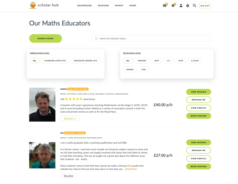
  • Easy and intelligent search to find the right educator
  • A streamlined booking process for both the student andeducator
  • Quick communication via on-platform messaging
  • One-click future session bookings and payments
  • Instant AI-powered ID verification for educators
  • Advanced technological security
  • Secure card handling
  • Social feeds
  • A comprehensive learning space, allowing students/educators to video call, share screen, use an interactive shared whiteboard, message, and send files – all in one online platform.

Scholar Hub is still in its early days, but I’m excited to see where they go and support them on that journey.

If you’re looking to learn something new, or would like your children to learn something extra outside of school, then head on over to https://www.scholarhub.co.uk/.

Are you looking to have your own platform developed? Contact me to find out more today!

How to work remotely as Coronavirus strikes…

So COVID-19 (Coronavirus) is now a super real thing, and looks like it will have detrimental effects to our way of life, the economy, health, and so much more. In light of recent events, a lot of employers are looking at how their employees can work remotely. It’s a big change for a lot of them, but it’s something that should be embraced and comes with numerous benefits. As a remote worker, you:

  • Don’t have to spend time commuting, which could be 2 hours (or even more) for some people every single day
  • This means you save money on travel (fuel, trains, etc)
  • It also means you have more personal time. If you start work at 9am, and your commute doesn’t exist because you’re working from home, then guess what – you have plenty of free time up until 9am. It also means when 5pm arrives (or whenever you finish for the day), you don’t have to spend more time getting home – you’re already there
  • Can generally focus more and not get involved in office politics, and other pointless office tasks

I’ve worked remotely for at least 6+ years as a web designer/developer, and luckily I’ve being busy for every day of that so I’ve had no time to slack off. But below are my tips for working effectively from home, and creating that streamlined environment to get your work done.

Time management

If you’re new to working from home, then this is especially difficult. It’s extremely tempting to do some washing up, watch a film, not get out of bed, and so on. Unfortunately, do enough of that during working hours and your team will soon know about it through the volume of work you’re producing.

Be strict with yourself, and make sure you only do work between your allocated hours. However, you can always make the most of being at home during your lunch break (and any other breaks).

This is partly related to creating a good working environment…

A distraction free working environment

Yes, there are numerous distractions while working at home. Whether it’s the house work that needs doing, or that great new series you’re hooked on. In order to stop these distractions and temptations, it’s ideal to create a working environment to separate you from your private life.

I always stick to working in my home office. It creates separation from my personal life, and only includes work related equipment. This way, I can’t be tempted to switch on the TV or walk over to the dishwasher and empty it. However, not everyone has the luxury of a home office – but it doesn’t mean you can’t create your own separate work environment. Whether that’s a desk in the corner of the living room, or a dining table – as long as you’re not slumped on the sofa or in bed on your laptop, then it’s better than nothing.

This also helps with switching off, you can leave your working environment when the day is complete and spend time with your family.

Reliable technology

There’s nothing worse than working from home with a sub-standard WiFi connection or a really old computer. It slows your down and makes your work process unbearable. You will need the ability to take calls over the internet, upload files, send emails, all without your internet losing connection half way through.

This related to the distraction point above, but it’s always ideal to purchase a pair of noise cancelling headphones. It can block out the surrounding environment if others are at home with you, and also allows you to focus more in your own little bubble. I personally use the AirPods Pro – great piece of kit!

Depending on the type of work you do, a second or external monitor is a great way to make use of screen real estate. With more working space on your screen, you can have multiple windows open at the same time – thus boosting productivity in some cases.

Communication

If your team are used to seeing you face to face, then all of a sudden remote working can be a small shock to the system. Luckily, there are numerous solutions out there to keep you in touch with your team, such as Skype, Slack, Zoom and Google Hangouts.

It’s important that communication is maintained so everyone is aware of progress, and so that help/support can be given to you (or from you) where possible. This keeps all teams engaged.


Overall, to just remember to stay healthy and look after yourself as working remotely can also be a fast tracked way to becoming a couch potato!

On another note, I have a job that allows me to work from anywhere. If you’re looking for a web designer, web developer, or online software developer, then visit my main website to read more about me and get in touch!

Designing & developing my new website for 2020

It’s been at least a year since I even touched the design of my site, and with how fast the web moves forward in terms of both design and development – I thought the start of the year would be a good time to address the situation (go check it out at https://jamesdowen.com/).

My site currently ranks well for specific keywords, so the main challenge was maintaining those crucial rankings. One of the most important SEO ranking factors today is pagespeed, and with my old site scoring 99/100, this was pretty hard to match, let alone beat. This alone involved taking great care during the programming stage, and ensuring every asset was appropriately compressed and served, but not to the point where the assets lose too much quality and begin to look blurry.

The other is content. My site has always being a one page site since its inception, so I’ve kept that same structure and same content throughout (apart from changing a few words). This means the design refresh uses pretty much the exact same content as before.

Old version of jamesdowen.com

Another key concept was to include animated elements, fitting in with a modern web trend of creating engaging content. On desktop, we feature an animated particle blob effect that the user can control with their mouse. This is a quirky feature to help boost interaction. This isn’t present on tablet or mobile devices though due to performance issues.

Animated particle blob

As well as that, we have certain user controlled elements that are binded to scrolling events. The example below shows the / (forward slash) rotating with the speed that the user scrolls.

Rotating element on scroll

Further down, we have the services bubble, which essentially lays out my skillset surrounding a picture of desk/office space. Rather than it be displayed as a static image, I wanted to bring some life to this section. The background features a forever looping bubbling effect, creates with pure CSS, and each skill floating gently with a slight overlay.

Services bubble

Last, but not least, we have the menu and the start project/contact section. The particle explosion that takes place when opening and closing the start project area is something cool that I’m happy we adopted and managed to fit in.

Menu and contact sections

If you’re looking for a new website, then head to my very own new website at jamesdowen.com and I’ll be happy to help you. I’m a freelance web designer and developer, and I’m available to work on websites, web-apps and online systems.

My thoughts on the 2019 16 Inch MacBook Pro

Since 2017, pretty much all of my work was produced from the then-new 2016 15 inch MacBook Pro with the touch bar. I never switched right away, as I was a stubborn Windows user at the time and sworn by it, but after some temptation (well, peer pressure), I made the switch and bought the 16GB RAM model off Amazon at a slightly reduced price.

I never looked back, and my Windows tower PC has been locked away in the garage ever since. I’m not even sure it turns on now.

Anyway, fast forward to 2019 and I’m in love with the MacBook experience. So in love that I ploughed nearly £4,000 on a more specced our 16 inch MacBook Pro in November just gone.

The specification I ordered.

I’ve now used the 2019 model for just over a month, and it fulfills every one of my needs and brings some much welcomes improvements on the 2016 model, including;

  • The new scissor switch keyboard, which hopefully means I won’t have to take this laptop to Apple 3 times
  • The return of the escape key, which is so much more developer friendly
  • The 16 inch screen, of course. That extra screen space actually makes a huge difference
  • The extra power with the much higher spec configuration

The MacBook is perfect for me because it allows for portability within seconds, but also allows me to use in “desktop mode” while connected to my ultrawide external monitor (which is 90% of the time).

Olderposts

Copyright © 2025 James Dowen